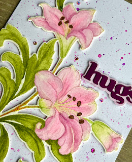
When I was picking my final classes, this class was something that I really wanted to take, but really scared me. I’ve never been a painter other than slapping on some paint and maybe a tiny bit of blending. I think some of that comes from the fact that I get too impatient to spend the time with making the beautiful pieces that the excellent watercolor painters make.
But the instructor, Jaycee Gaspar, is such an inspiring
artist, I decided to give this a try. I
would highly recommend this class as he starts from the beginning with techniques
and works you through botanical illustrations.
My final project is something I really like. I don’t think it is perfect, but it showed me
that I could make flowers look more realistic.
And with practice, I am sure I can get better. It also showed me that I can slow down and
really spend some time in painting and can find it very relaxing.
But enough about me. In today’s blog, I won’t be telling you a lot of techniques but going through some of the tips I learned to help me not be so scared next time.
I started today with the Altenew Watercolor Paper Set – 5x7 and stamped the Altenew Craft Your Life Project Kit: Feathered Lilies using Altenew Crisp Dye Ink – Morning Frost . I used this ink as it is a light gray and would give me a no-line look in the end.
After stamping this, I took the panel and I used a
low-tack tape to adhere to an acrylic clipboard. I taped almost completely around, only
skipping where the stamped image was close to the edge. In the class, Jaycee recommended stapling to a wood board (with plenty of space to cut out when done). Securing this will help to keep your paper
from warping.
I like the acrylic clipboard as it is easy to move around while painting. It is also what I had available and my panel was flat when done.
I used the Altenew Watercolor 36 Pan Set and the Altenew Fine Watercolor Brushes for my painting. I swatched out each coloring. In the class it was recommended to swatch each color combination if mixed, but I only did that for the ones I was using today.
I found today’s watercoloring relaxing. My petals are similar to the flower I had, but I do know they are different in some ways as well. I had bought the flowers and let them sit for a couple of days. Some of the brown from the stamen had transferred to the petals and I did not want that in my petals on my project.
I also found that when I asked my 2 daughters, they saw different primary colors than what I saw. So, I do believe that some of this is based on who is looking at the flower and the project. Overall, I do feel that I was able to mix some primary colors of the flower and leaves and come up with a better painting than I have ever done. And honestly, nobody is going to compare my card to the exact flower I had......so I am pleased that my card looks a little realistic.
I did set the painting aside for a few days and did a little touch-up after that.
My next question was, should I die cut this out or should
I paint around it or just leave it and cut it down. I ended up die cutting. Then I took a card base (5” x 6.5”) and added
violet and pink passion splatter over it.
After that dried, I attached the flower image on foam tape.
I picked the Hugs sentiment from the Altenew Versatile Greetings Die Set . I picked out several pieces from my scrap pile to find which color I wanted to used for the hugs sentiment and the shadow.
I adhered this on foam and added a few jewels.
I am very happy with this card. And I will be trying some more
watercoloring. I will just make sure
that I have plenty of time so that I can enjoy the process and the relaxing
aspects of watercoloring.
Happy Crafting.
Donna T.
Products Used:
Altenew
Craft Your Life Project Kit: Feathered
Lilies
Altenew
Versatile Greetings Die Set
Altenew Fine
Watercolor Brushes
Altenew Crisp
Dye Ink – Morning Frost
Altenew Instant
Dimension Foam Tape
Altenew
Watercolor Paper Set – 5x7
5 x 6.5 White Card base
Colored cardstock from stash
Jewels from stash
Brutus Monroe Aqua Splash – Violet
Brutus Monroe Shimmer Splash – Pink Passion
Stamping platform
Watercolor Palette
Low tack Tape
Acrylic clipboard or some other hard surface


Piece of art!! Brilliant!
ReplyDeleteThank you so much!!
DeleteThese look so beautiful! Can't wait to take this class and give it a go!
ReplyDeleteIt was a great learning experience......I was nervous at first, but ended up really enjoying it.
DeleteSo very pretty!!
ReplyDelete